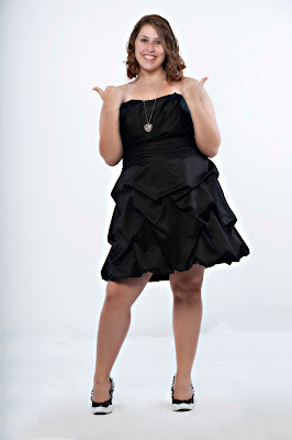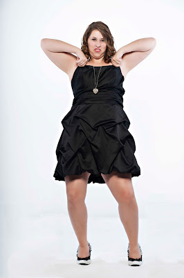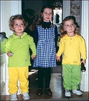
Today is Stinky's birthday!...


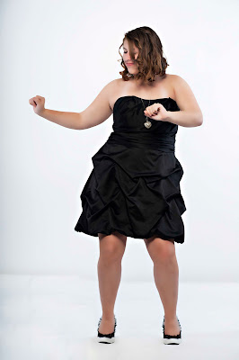
Molly, the oldest of my Irish triplets turns 16 today. It's a very happy happy/sad day.... I love the woman she is becoming but I miss the little girls she was.

When she was really little Molly thought all the hoopla on Halloween was in celebration of her birthday, and of course I did nothing to dissuade her from thinking that.
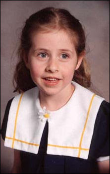

Let me share two quick stories that shows what kind of person my Molly is.

Story 1:

She was 6 at the time, had long hair, way down her back long hair and one day came into the kitchen and announced to us that she wanted to have her hair cut off so she should could "donate to the company that makes wigs for sick kids", then she turned and walked away. Her mom and I just looked at each other until one of us finally said "where did that come from?".

Our plan was to just wait and see if it was something she still wanted in a few days. Well, by the end of the week she had bugged us so much that I was ready to let her shave her head, get tattoos, and join a biker gang.

So down to the hair solon, off came the hair, and it was sent off to Locks of Love.

Story 2:

We really get into Christmas at our house, for weeks we'll tell elaborate stories about what we want most and why, and one year I wanted a telescope. We had marked the day on the calendar when Santa was going to be at the fire station (he lands on the roof and comes down the big ladder to see the kids) and when the day finally arrived it was cold and the line was long, long, long, so it took some time before we reached the big guy. When it was finally her turn with Santa he asked Molly what she wanted and without hesitation she said "I want you to bring my dad a telescope".

Ya, I was speechless.

Now she is taller than her mom, looks far more like a woman than I like, and has a man in her life other than me. But she still kisses me before she leaves the house, will sit next to me on the couch while we watch TV, she will say she loves me in front of her friends, and is still the same caring girl who gave her hair away and used her time with Santa for the benefit of someone else.

Happy birthday Molly, I love you!


Wandering off the reservation...

As our regular readers know, and all the new ones are about to find out, on weekends I tend to "go off topic" from photography and post on just about anything.

Things that are interesting, topical, or important (at least to me).

My daughter was reading a magazine and saw a short blurb about a new theme park that was designed for people with special needs and said "you should tell people about this".

I thought she was right.

Being the fortunate parent of children that don't have special needs I've never thought about the things those families don't have access to, the family trips (and fun) they haven't had.


So, todays wandering is to share with you "Morgan's Wonderland", it opened just 6 months ago, and is "the World's First Ultra Accessible Family Fun Park designed specifically for children and adults with special needs, their family members, caregivers, friends and the entire community".

Morgan's Wonderland is in San Antonio Texas, sits on 25 acres, and looks like such a fun place.

When I saw the eyes of this young boy I saw pure joy.


So please check out their website, the parks different attractions, and their live webcam.

But most importantly tell others about it.


A wedding video with a new twist...

Here is a wedding video that was sent to me, the twist for this wedding video is that it's done in stop motion/action, something I have never seen before.

I like the uniqueness of this but wonder about the long term viability of this style when it comes to wedding videos.

The video is posted below and I would love to hear what you folks think about this style.

For subscribers you will need to return to the blog as videos are not pushed through with your subscription email, sorry.


Nikon D60 book review...


This is the second in a series (of 3) book reviews done by our readers.

All three books were kindly provided by "Stay Focused Press", todays book is for the Nikon D60, and the review is done by reader Paula Apro.

From Paula:

"I really liked the way “Stay Focused Nikon D60” was organized by problems and solutions to those problems, rather than a step-by-step rundown of all the features. It groups the most common problems that people experience and puts them into different chapters. Each issue offers several different solutions depending on the specific conditions. For instance, a photo can be too dark for several different reasons and each one is fully explained with its individual solutions. The sample photos do a great job at illustrating both the problem and the fix. This makes it easy to jump around reading the items that pertain to your most pressing needs.

Before the groups of problems and solutions, the book starts off with a really handy section called “Boost Your Camera IQ.” This is invaluable for those new to DSLR photography (which many people with the D60 are) and it’s also a great review and refresher for those more experienced shooters.

All of the biggest issues with taking nice photos are covered including, fixing pictures that are too dark, too light, blurry, using the flash, slowing motion, etc. Just about all the bases are covered for the amateur photographer. Each solution includes a page with illustrated step-by-step camera settings. These illustrations show the screens where the settings are to be made. Very handy indeed because most photographers are visual people and will appreciate these supporting graphics.

In addition to the graphics showing the camera settings, the most powerful illustrations are the side-by-side before and after pictures. One picture illustrates the problem and the next shows the result by making the suggested settings. It’s almost not necessary to read if you’re using this book as a reference. You have a problem picture, you pick up this book and look for a picture that resembles your problem, and then match your settings to the ones shown for that issue. Well-la, problem solved!

No matter how much experience you have you are bound to pick up a few new neat tricks. And the refreshers on the basics are always valuable. This book will be especially handy to keep near by when you need a quick reference to the correct camera settings to get that perfect shot."

You can get you own copy of the "Nikon D60" guide as a hard copy book ($22), a PDF ($19), as an iPone/iPod app ($4.99), or for your iPad ($9.99).

Thanks Paula and thanks Stay Focused Press.

Our "Sessions with JoeyL" contest...


Here are just a few of the (many) images that have been entered into this months contest to win "Sessions with JoeyL".

You can find all the details and rules for entering our contest here, and you can head over to our Flickr group to take a look at the fine work our readers have been submitting.

In the mean time, enjoy these images.

(click on any image to view larger and in a new window)


Canon XSi book review...


I recently asked three readers of Weekly Photo Tips to review instructional books specific to the camera they shoot.

The books are from "Stay Focused Press", todays book is for the Canon XSi, and the review is done by reader Chris Scott.

From Chris:

"Like so many of us that get a new DSLR camera, we fail to read the owner’s manual and go straight to the gear to start using it. This book is aimed at the majority of new camera users that do the same thing.

Starting off, it goes over the three tenets of exposure: ISO, shutter speed and aperture. Diagrams and example photos are given to differentiate what each one means to the exposure. Depth of field is also explained and how that is created or minimalized.

For those that have used a camera before and understand photography basics, you then move onto the rest of the book. Like a troubleshooter’s guide to photos, you are given solutions to a large variety of scenarios and problems that arise.

Photographers would find this book the most rewarding if they picked up the camera, started shooting, and then viewed the photos afterwards. Upon reviewing your shots, you might see a blurry photo, or one out-of-focus, or another one that’s really orange-looking taken inside. You would then look up that specific issue in the last nine chapters of the book and find out what you could have done to improve the shot and not make that mistake next time. Want to take pictures of your kid’s soccer game? It has a whole section to prepare you with what you need to know to take the best possible shots.

The value of this book is its hands-on practicality. It doesn’t waste time with the delving into photography history or the scientific concepts behind aperture. It goes directly to the point and gives you the best information possible - with ample illustrations - of how to pick up your Canon Rebel XSi and know what you are doing."

You can get you own copy of the "Canon XSi" guide as a hard copy book ($22), a PDF ($19), as an iPone/iPod app ($4.99), or for your iPad ($9.99).

Thanks Chris and thanks Stay Focused Press.

Yes, we do have YouTube Channel...


Today Miguel left a comment on the blog that he didn't know we (Weekly Photo Tips) have a YouTube Channel.

Miguel is a pretty active reader/participant of this blog and if he didn't know about our channel I figure there must be a bunch of other people who don't know as well.

So head on over and take a look at Weekly Photo Tips on YouTube, you might event want to subscribe so you'll be notified everytime we upload a new video.

Of course there is a chance that Miguel was pulling my leg.

;)

My acting debut...

It's probably the kind of acting debut that will have people longing for the days of silent movies.

;)

My friend (and fellow photographer) Mark has jumped into videography/cinematography with both feet. He is so passionate about video that he travels with a mini studio in his car, and when you drive a Prius that's no easy task.

The Portland Phoenix (a local weekly paper) is having a film festival/contest and below you will find the short film Mark made to enter.

He shot it in a day at one of the old (and abandoned) factories near our studio.

Mark wrote, shot, edited, and more for this short film... you name it, he did it.

You should take a moment to check out his YouTube channel, for that matter check out the Weekly Photo Tips YouTube channel too because Mark did all the hard work in every video there as well (I'm simply the eye candy in front of the lens).

And if you ask me the camera puts on waaaaay more than ten pounds!


Mastering HDR in Photoshop CS5 - Our review...


I swear that if you looked up "HDR" (high dynamic range) in the dictionary you would see a picture of Matt Kloskowski.

The DVD, "Mastering HDR in Adobe Photoshop CS5" is from Kelby Training and is 2 hours and 15 minutes of everything Matt knows about HDR, which I think is everything there is to know about HDR.

Matt walks us through what HDR is and why you would consider using it, the different styles available to us, from getting a more balanced and natural image, shooting a night image, and ends with an image with that fantasy, surreal look. He shows us the series of images we would want to capture (and why) and what finished image would be.


Following his explanation of what HDR is Matt provides important tips to consider when shooting (like using a tripod and cable release), what your camera setting should be, and how many frames you need to capture. He even even explains why (if you are shooting Nikon) you would shoot 5 images but only use three of them.

That's just the warm-up.


The real meat of this instructional DVD is how to process HDR images.

It starts with opening images in the HDR Pro dialog box and shows us (in detail) how an image will respond to each and every slider, button, and check box. He then shows us the best settings to use for the type of HDR image we are trying to create.

From the HDR Pro dialog box the image is then brought into Photoshop, camera RAW, and Photoshop (again) for its final processing.

But wait, there's more.

Matt also walks us through a complete HDR workflow for Lightroom and another (complete HDR workflow) for Bridge.

Still not done (I feel like an infomercial, "wait, if your order in the next 10 minutes...").

Ever wonder what an image would like like with an HDR look but only have a single shot? Matt takes us through that process as well, along with teaching us how to create an action for future use (if you don't want to create your own action you'll find Matt's on the DVD for us to use).

Some of the things I like about the DVD is that it's presented in small manageable bites, no segment is more than 13 minutes in length so it doesn't seem overwhelming and it's also easy to keep track of where you've been.

Matt's teaching style is thorough and easy to follow, even if you have never heard of HDR before you would be able to follow along AND master everything that is presented on the DVD.

All of the RAW files that Matt works on through out the DVD are included so you can easily follow along, step by step.

There are iPod/iPad files included for truly mobile learning.

Now for the things I don't like... well... ahhh... insert sound of chirping crickets here... because there is nothing I don't like about "Mastering HDR in Adobe Photoshop CS5".

If you have an interest in HDR photography want to learn everything there is to know about it you'll want (and need to) pick up "Mastering HDR in Adobe Photoshop CS5", anythng else would be incomplete and a waste of your time.

Serioulsy.


Photoshop Elements - tutorials & resources...


An email from a reader prompted todays post (thanks Bill).

Because I don't use Photoshop Elements I have dedicated very little space to writing about it (out of ignorance not because of snobbery), so I hope to rectify it with todays post.

So what follows is a bakers dozen of blogs, websites, and podcasts that are dedicated to Photoshop Elements. I would appreciated your feedback on which ones you found most useful so I can create a list of permanent links for future reference (and future readers).

1. Photoshop Elements Techniques has a great many resources and a learning center that will help you get the most out of Elements.

2. Tim Grey has video tutorials, a YouTube channel, and a weekly Elements newsletter you will want to check out.

3. Head over to AdobeTV for Element video tutorials.

4. EasyElements.com not only offers tutorials, but free things like free brushes too.

5. Photoshop Support has put together a very nice Photoshop Elements Resource Center.

6. Alibony has both a website and a blog offering a collection of Photoshop Elements tutorials, tips and goodies.

7. SimplePhotshop.com is an "Animated Introduction to Adobe Photoshop Elements" with 8 video-tutorials.

8. Tutorials Experts offers almost 50 video tutorials collected from various sites.

9. Photoshop Roadmap also offers a large numbers of Elements video tutorials.

10. About.com has also compiled a HUGE list of Photoshop Elements tutorials and resources.

11. The Essential Guide for Photoshop Elements, the title pretty much says it all. They have a blog too.

And wrapping up the resources are a couple podcast you will want to check out:

12. Adobe Photoshop Elements Killer Tips By Corey Barker.

13. Graffi's Graficalicus Workshop

The client from hell...

This is a funny video, at least it was while I was watching it.

When it was over I started going through the clients that have said these things to me and I found myself in the fetal position, sobbing like a baby.

;)

But seriously, chances are that there is little you can do for (potential) clients who are fixated on pricing as their focus is strictly on what you cost, NOT the services you provide. Run (not walk) in the other direction because you will never do enough so they will feel they got their money's worth.

Lowering your price to gain one client is such a bad idea for so many reasons, if previous clients find out you "negotiated" they will not be happy they paid the full price and will never come to you again, future clients will expect you to "negotiate" with them as well, and in general it will send the message that you are not serious about what you do.

That said, enjoy the video, subscribers will need to return to the blog to watch it as videos (still) don't get pushed through to you.


"Limited Edition" marketing tool... our review...


V Gallery has produced yet another "must have" marketing tool for any photographer that is looking to make money with their camera (make sure you check out the special offer at the end of this post).

This is not marketing "theory" it's what V Gallery has been doing in their own studio for some time and, as is their style, it is so complete that if you wanted all you would need to do is remove their name and insert yours.

There is a reason of all the products we reviewed in 2009 it was a V Gallery product that was named "Product of the Year", they produce great stuff.

The "Limited Edition" module contains 13 mini sessions that you run throughout the year, each session comes with documentation, instructional videos, Photoshop templates, actions, sample images, Facebook marketing info, email marketing templates and so much more.

If mini sessions are new to you they are usually a 15-minute session with a theme, has a reduced session fee, and is for one day only.

These unique "themes” appeal to families with children, while allowing the photographer to shoot multiple clients in the time that it would normally take to photograph just one.

It's a win for the studio and a win for the client.

Here is a description of 5 of the (13) sessions that are part of this module:

That’s Amore: That’s Amore is a simple Valentine’s Day theme. Featuring pink and red hued backgrounds, outfits, rugs and furniture, this event attracted parents of young girls and babies.

Just for Dad: Just for Dad is targeted at fathers and their son(s) and/or daughter(s).

Dog Days of Summer: The Dog Days of Summer event is our most popular event for pets. We coordinate with our local, no-kill animal shelter to raise awareness and donated pet food.

Vintage Fields: Vintage Fields is shot on location, in an outdoor setting like a beautiful nearby field. We use several props including an Urban Outfitters chandelier, an old bathtub we found on Craigslist, umbrellas, a few wooden crates and more.

Christmas in September: This event was created to allow families to get a head start on holiday photographs and encourage them to purchase Christmas Cards.

Though this product may not be for the casual photographer, it's a MUST for those who want to make in income with their photography.

The V Gallery Limited Edition module sells for $169 but the readers of Weekly Photo Tips can purchase it for 50% off this week only!

Yup, half price, simply type in the coupon code "WPTLE" at checkout to receive your discount. Keep in mind that the offer expires this coming Friday (10/22).

Delkin’s USB 2.0 universal card reader just $8!...

You can get the Delkin universal card reader for free (regularly priced at $24.99), yes FREE. It's yours in return for agreeing to allow Delkin to send you promotional emails (keeping in mind you can opt out at any point in the future).

It's an all in one, UDMA enabled, universally compatible, high speed USB 2.0 card reader, meaning it's fast and fits all memory cards.

You will need to pay shipping (just $8) and to get it for free you need to use the promo code "RANGE10" at check out.

I just ordered mine, use this link to get yours.

I need your help.... Please...

Professional Photographers of America is conducting a talent search looking for "a few good bloggers", especially those who blog for the benefit of other photographers.

Assuming you think I am one of those good bloggers I was hoping you good people would go to their Facebook page and leave a comment and/or link for Weekly Photo Tips.

Thanks!

Noisy picture tutorial part II...


A few people left comments (and emailed me) wondering what the image would look like color (as they liked the pink in her cheeks).

So I edited the image again but kept it in color, so here are all the steps I did for todays edit:

1. The first thing I did was reduced the noise (in Photoshop - "Filter", "Noise", "Reduse Noise") and as noise is less acceptable in color images I reduced the noise more than I did yesterday

2. Because I reduced the noise more the image was a bit "softer" so the next thing I did was some sharpening

3. The two things folks commented on the most was the pink in her cheeks and the character on her pajamas so to bring those out a bit more I burned both ever so slightly

4. Added a vignette

5. Added a 2 pixel black border (stroke)

So, the same picture, the same problem (noise) and a slightly different fix.

This was a more challenging edit (both today and yesterday) as the image was only 188k in size, had there been more pixels there would have been more to work with (and editing would have been easier).

Here is the origianl image:


(click on either image to view larger and in a new window)


Noisy picture tutorial...

One of our fine Flickr group members, Only Josie, uploaded this picture with the following commentary:

"just a portrait I love even though it's terrible quality - iPhone 3G camera, low light, noise from hell - but it just captures my older daughter in sleep so well!"

Now I didn't ask her if I could use here picture for this tutorial (and probably should have) so my hope is that she does not come to Maine and do me great bodily harm! Here is her image.


Let me say first that I love this picture! You look at it and it gives you a sense of peace and quiet that comes only when our child is asleep and I am willing to bet you are not going to get this little girl in bed without her puppy.

Another reason I love the picture as that it reminds me of my daughter when she was little, in fact she still has that exact dog (his names is bones) and even though she is now a teenager and high school that dog not only sleeps with her, but when she makes her bed he is tucked in nicely.

Back to the picture, the first thing I think of when it comes to noise is "black and white", though noise can be a distraction in a color image it will work wonderfully in black and white.

Here is what I did:

1. Converted the image to black and white

2. It appeared even noisier after the conversion so I reduced the noise

3. I ever so slightly brightened her face

Here is the image after these adjustments:


As I looked at it the outer aspects of the image were brighter than the center which would cause your eyes to drift off center (the subject) and (eventually) off the image itself so to keep your eyes in place I:

1. Added a vignette

2. Added a 2 pixel black border (stroke)

And here is my final edit:


Josie, I hope you don't mind that I used your image, and REALLY hope you don't hurt me.

(click on any image to open larger and in a new screen)

The "Sessions with JoeyL" contest starts today...


If you would like a chance to with "Sessions with JoeyL" here's what you have have to do:

1. Join the Weekly Photo Tips Flickr Group (details on how to join can be found here).

2. Upload one (or more) portraits of a person, animal, or car to our Flickr Group.

3. Leave on (or more) comments on any blog post on Weekly Photo Tips.

The contest starts today and ends November 15th, the winner will be randomly drawn from all contest entries and announced on November 16th.

The winner will receive a link from Joey Lawrence to download "Sessions".

The rules are pretty simple, you can enter as many times as you like (one comment + one image upload = one contest entry), ownership of all images remain with you.

The only thing we will use them (the images) for is to show an occasional "sample" of image contest entries and to announce the winner.

Good luck everyone.


It's funny...

Not funny ha ha, more like amusing... but I get far more emails sent to me than comments left on the blog.

And the latest batch (of emails) have been asking how I made lighting diagrams like the one in yesterdays (and other) posts.

You have several options:

The first is from Kevin Kertz, he put together a layered .psd file that allows you to add, delete, and modify commonly used lighting components and is really easy to use.

He put it together in 2006 so some newer photography wiz bangs and oohh la la's will not be available to you. If you hit this link the download will start.

The second option is newer, in color, does include some of the newer wiz bangs and oohh la la's and is from QH Photography. Not only is this one newere, you also get the option of a Photoshop and/or a Photoshop Elements version. You can download them both at this link.

Lastly, if you have an iPhone (iPod touch, or iPad) you should consider downloading the Strobox lighting diagram app. This one allows you to document your lighting setup while on location.

All three are free and come in handy for documenting a lighting setup that can be referred back to at some time in the future.

Lighting setup for the model shoot...


We used three lights for this shoot, but really only one was used to lite our model.

For all the shots that had our model standing we used a three light setup, the two lights on either side were large softboxes that were used primarily to lite the white wall behind her (with the intension of blowing it out). We used a beauty dish with a diffusion sock to lite the model herself.

One thing I would do differently is to put something between the side lights and the model as there was a bit more spill than I would have liked. In his 3 day seminar Zack Arias showed how to used some very inexpensive folding doors from Lowes or Home Depot for this exact purpose.

You can still buy
(and download) the video files from this seminar for an incredibly reasonable price ($129) here. You can read here why I think it's one of the two most important things you can buy if you are serious about photography.


All of the images shot in the red "pleather" bench were shot with just a beauty dish and diffusion sock. We used a piece of Rosco Cinefoil as a "visor" on the side of the beauty dish closest to the wall, it acted as a flag (or gobo) to keep light from spilling onto the white wall.

There was a comment on yesterdays post asking about a DIY beauty dish, you can read our post and see sample images of the beauty dish I made here, you can also watch our YouTube DIY beauty dish video here.

Below is an outstanding video Mark shot in between running around as my lighting assistant, he did a great job at both tasks. Watching it will also give you a better look at our lighting setup.

If you are a subscriber you will need to return to the blog to watch it as videos (still) don't get pushed through with your ubscription.

(click on either image above to view larger & in a new window)


Model shoot with Bogdana...

We had the pleasure of shooting with Bogdana for the first time last week, and will be shooting with her again today.

The images below are all essentially one light shots. The images shot on the red seat were lit using just a beauty dish (and diffuser sock), the images with the white background did have three lights, but two of them were used to light the white wall behind her and just the beauty dish was used to light Bogdana.

I will post more about how we lit Bogdana along with a video of the shoot either later today or tomorrow.

(click on any image to view larger in a new window)


We have another contest winner...

We can't do this for every contest... but will one more time.

Because Miguel was the first to congratulate our latest contest winner I wanted to reward him for being such a "gracious non-winner".

We will be sending him 4 SlimLine "AA" battery caddy (you read our original battery caddy review here).

Be sure to check out Miguel's Flickr stream here.

Congratulations Miguel!


A cool Lightroom trick from Kevin Kubota...

I have received several emails recently asking how to synchronize images in Lightroom when multiple cameras were used but their clocks were not sync'd beforehand.

So here is a previous post that will walk you step by step through the process of synchronizing those images, it works perfectly, I know because I have used it (more than once) myself.

If you've ever shot an event with more than one camera and/or more than one photographer and forgot to synchronize the time on the cameras, then you've lived through the nightmare of trying to get all the images in their correct chronological order.

The last wedding I shot with Stacey Kane involved 4 cameras and well over 5000 images!

Getting that many images "chronologically correct" can be problematic (but extremely important). I learned how to synchronize my images from Kevin Kubota and I'll share that "trick" with you now.

If you're at an event and suddenly realize that you forgot to synchronize the time on your cameras, do the following:

1. Take a shot of an inanimate object (like your foot) with each camera, be sure to fire the cameras at the same time
2. You now have "sync" images
3. When you bring the images from that event into Lightroom you will use these images to get all the images in order

But what if you don't realize until the next day that your cameras wheren't synchronized, then what?

4. Look for a key point in time (such as "the kiss" during a wedding, because everyone shooting the wedding will capture that precise moment)
5. While in the Library mode (in Lightroom) you will select (highlight) one reference image from each camera used (the picture of your foot, the kiss at the wedding, or whatever key point image you have chosen as your reference)
6. You will pick (in your mind, not Lightroom) one camera as the "Master Camera" and the reference image from that camera will be your "Master Image", the images from all other cameras will be adjusted to match the master image
7. Write down the "time shot" for the "Master Image" (you'll need it later)
8. Go to the "Metadata" browser window in the left panel
9. Select the "Camera" sub-menu and beneath it you will see all of the cameras used
10. Select the secondary camera in the "Camera" sub-menu
11. Just the images taken with that camera will be displayed (included highlighted image you selected before)
12. Select all that cameras images ("CRTL + A" for Windows or "Command + A" for MAC)
13. From the top menu select "Metadata" then "Edit capture Time"
14. The "Edit Capture Time" dialog box will be displayed, along with your reference image
15. Remember the time you wrote down from your Master image? Write that it in the "Correct Time" box and select the "Change All" button

All of the images shot with the secondary camera will be adjusted accordingly and all your images (from both cameras) will now display in correct chronological order.

If you shot with more that two cameras you will select one reference image from each camera (step 5), then follow steps 10 through 15.

Who wants "Sessions with JoeyL"?...

Yup, just found from Joey Lawrence that he is donating a copy of "Sessions with JoeyL" as the prize for our next contest.

How cool is that?

The contest will be starting October 15th, we will post the details soon.


The work of which I am most proud... again...

Robert N. Dechene, 23 / Army – Tour of duty 7/16/67 – 9/17/67

Raymond A. Borduas, 20 / Marine – tour of duty 5/5/68 – 6/4/68

This story was originally posted when I first started this blog, and because of the significance of the work (to me) and the dramatic increase on folks visiting this blog I wanted to dust it off for more people to see.

Of all the work (photographically) I have done, these two images are what I am most proud of. Though they may have little to do necessarily with photographic skills, the families (and fellow veterans) think them to be wonderful “pictures”.

I was a green beret (special forces) at the end of Vietnam, so the fact that seven boys (literally, boys) from this small town in southern Maine where I call home never returned is of significance to the people who live here.

After more than 30 years (and for the first time) I finally visited the Vietnam War Memorial. While there I took a picture of the panels that hold the names of these two of young men.

Here is a (very abbreviated) overview of what I did In Photoshop:

1. Burnt all but their names so they were pushed to the background but still viewable
2. Painted their names white to make them stand out
3. Took one of their old pictures (scanned it) and converted it to digital
4. Combined their old photo with the photo of the wall that bore their name

It was difficult at times working on these images, having these young men literally “looking” back at me… and at one point the Pink Floyd song “Wish You Were Here” came on the radio… I will save you the details; suffice it to say I was glad no one else was at home.

Then it came time to give them to the families. Roberts family had been told something was going to be delivered to them, all of the family and friends in the area had gathered at the house and were waiting… after they passed the picture around several times and looked at it for awhile, they all climbed in their cars and headed to the nursing home where his mom now resides, so she could see it.

Rays family was equally as grateful; his brother has been to my studio more than once to thank me.

I did not do these for praise or recognition, but because these boys deserve to be remembered and I wanted to do my part to make sure that happens.

And the winner is...

A couple things before I announce the winner.

First, I LOVED looking at all the images that were uploaded, trust me when I say I looked at every single image and they were outstanding. Because of all the great stuff that was uploaded I think all future contests will include folks uploading (at least) one image.

Second, this contest was truly random. The name of each person who entered was dropped into a program called "The Hat" and it was used to randomly pick the winners name.

I just don't want folks to think that they didn't win because their mage "wasn't up to snuff" because nothing could be further from the truth. The one thing I DON'T like about contests like this is that I can't award prizes to everyone who entered.

I strongly recommend that everyone go take a look at the images that have been uploaded to our Flickr group, you'll see some real good stuff.

Now, drum roll please.... our winner is... JW Stovall!

Congratulations. If you send me an email with your snail mail address I will get your prize right out to you.

Below are a few of the images he entered and be sure to check out his blog and website to see more of his work.

Our next contest will be announced very soon, as we have some really good stuff to give away.

(click on any image to view larger and in a new window)