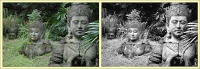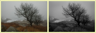

I love black and whites, in almost any setting they are elegant and timeless (unlike my wide collars and big bellbottom pants), they can also take a mediocre image (or one that is down right crappy) and make something more of it.
Above you see a couple examples, not necessarily of crappy images, but of my black and white conversions using the technique described below. If you click on either image, they will enlarge in a new window.
Photoshop CS3 has a new black and white conversion tool as part the adjustment layer options, and I have tried it on more than one occasion but I prefer my method. And before you think “my gosh, that fat guy is a smart one!” I must give credit where credit is due, I learned this from Scott Kelby some time ago, loved the results, and have used it ever since.
So let’s get started:
1. Make any tweaks and adjustments to your image, contrast, levels, blemish removal, etc.
2. Go to the layers pallet and select Channel Mixer.
3. Select the Monochrome check box in the bottom left of the Channel Mixer dialog box.
4. Bring the Red slider to (roughly) 75%
5. Drag the Constant slider to (again, roughly) -10 to -12
6. Then play with the green and blue sliders until you get the detail and contrast you are looking for.
7. Once you’re happy close the Channel Mixer dialog box (by clicking “OK”).
Be aware that should your Red, Green, and Blue slider totals more than 100% (combined), you will see a small triangular icon with an exclamation mark it. Not to worry, your mouse won’t freeze, the image won’t explode, it’s Photoshop giving you grief that you have exceeded 100%. Why? Not a clue.
You may want to save a copy of the image as a .psd file, in case you want to come back and play with it at another time, then save it in the file format you use for printing, emailing, etc.
For me, after I flatten the image, there is just a little more to do:
1. Create a copy/new layer.
2. On the copy layer, use your Burn Tool and evenly burn (darken, not burned black) the outside 10-15% of the image.
3. Us the opacity tool and drop it anywhere from 10-30%, depending on taste and the heaviness of your burn.
4. Again, save the image as a .psd and/or your preferable file format.
Now before I start getting email telling me that it’s called a “vignette” (not a burn), I already know that, but I was brought up in the projects on the outskirts of Boston, and we did not vignette, we burned.
And if the boys in the hood heard me using words like “vignette” the next time we got together for tea and finger sandwiches the giggling and teasing would be unbearable, Like the time I wore white before memorial day. I still tear up thinking of that.
In closing I just want to say that there was at least one report of a person running with scissors. Tsk, tsk, tsk, very disappointing.

2 comments:
Very funny stuff. I went to school in Boston for a while. Is the combat zone still there? I bet the guys in that hood don't use vignette either.
I think it has been gone for some time... the fact that we know what the combat zone was really shows our (old) age.
;)
Post a Comment