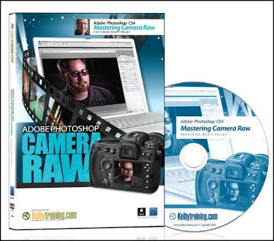
3 1/2 hours with Scott Kelby...


If someone asked who you wanted to learn Photoshop from who would you pick?

I am willing to be that the vast majority of people would say one name - Scott Kelby.

Over the last several days I watched his DVD "Mastering Camera RAW".

All 3 1/2 hours of it.

There were things I liked about the DVD before watching the first frame, like being able to load it onto an iPod or iPad for "mobile" learning, it also comes with all the same images that Scott works on during the lessons, so you can follow along with the same techniques on the same mages. For me, if I try following along with a dissimilar image the results are different and the lesson becomes less impactful.

Another thing I liked was that on four occasions during the learning process Scott stopped and using the techniques he just taught, he used them in a workflow. He then will teach you more techniques, then using all previous lessons perform yet another workflow. And he does through the entire DVD, adding knowledge and incorporating it into an ever expanding, more in-depth workflow.

Shortcuts. I love shortcuts. They save me time and they make me more efficient. My goal is to be behind the camera, not in front of the computer.

Throughout the entire DVD Scott shows a ton of shortcuts, both keyboard and software.

How frustrating is it to make a slider adjustment, not like the results, but not remember what the default setting was? Double clicking on the slider button will get you back to default. Want to move around an image you've zoomed into? Regardless of what panel you are in, holding down the space bar will give you the "grabber hand" allowing you to move freely around your image.

Scott covers every button, panel, and slider in the camera RAW interface and then stirs in his real world experience to make the "Mastering Camera RAW" DVD an incredible learning experience. With what he does to images in camera RAW Scott makes Photoshop look almost unnecessary.

If you have never used Camera RAW you will be able to follow along without being overwhelmed, if you are an experienced user I promise you will learn something new.

I prefer DVD to live learning as I can always throw in the DVD and refresh/relearn something. It's like having Scott Kelby teaching when it's most convenient for me.

If you would like to be in the running to win the "Mastering Camera RAW" DVD all you have to do is comment in any Weekly Photo Tips blog post between June 1st through June 30th (2010) and your name will be put into the hat, with the winner being drawn on July 2nd.

One last reminder, Weekly Photo Tips will be coming down tomorrow (May 28th) and to be replaced with our Memorial Day slideshow. We will be "back online" late in the day on May 31st.

Hold onto your panties!....


Because you are about to be blown away with some stunning imagery.

I am sure, more often than I want to know, I will post about something I have come across and folks will scratch their heads and wonder aloud "has he been living under a rock"?

This will likely be one of those times.

While driving to New Jersey a couple weeks ago I listened to an interview of photographer Cliff Mautner, and as impressive as it was things got busy and I didn't follow up on it.

Yesterday I watched the latest edition of Photoshop User TV and Cliff was interviewed again. Scott and Matt went on about how impressed they were with his work so I went directly to Cliff's website.

And for the next two hours I wandered through his website and his blog looking at his drop dead gorgeous wedding images.

So go check out his work and his two and a half day workshop where he teaches "less is more" when it comes to light.

You will be inspired... and blown away.


Call for images of Veterans...


Memorial Day (weekend) will soon be upon us and as we have done for several years the blog will be coming down, replaced with the Memorial Day slideshow we created.

The plan was to create a new slideshow each year, but as with all good intensions life has gotten in the way, but I will be creating a new slideshow for Veterans Day (2010).

This is where you come in, I will be looking for images of veterans from our readers, the friends of our readers, and their friends too.

So please, send in an image of a veteran in your life (both living and those who have "gone on ahead"), ask your friends and families to do the same.

Email your image (max size 200k) and a line or two about the veteran that appears in the image you are sending in.

There is no limit as to the number of images you can send, if you have 5 veterans in your life, send an image of each and every one.

I promise that every veterans image I receive will appear in the upcoming slideshow.

So please, start spreading the word!


(legal babble - you will maintain all ownership and rights to any image you send in, you will be granting us permission to use it in this slideshow, which will be the only use we will make of it)

A word (or two) about our reviews...

This post was sparked by comments made on my last review and I figured if Sharon and Chris had questions, then others did too.

First, regarding reviews in general.

For various reasons about 25-30% of the products sent to us for review never make it to the blog (you can read our review policy here).

I take the trust of our readers (very) seriously and would never want to betray that trust so when I review a product it needs to provide me with something that will make my photography or my business better. It needs to bring something to the table. I then assume that it will do the same for others.

I take money seriously too, so not only does a product need to contribute, it also needs to make back the money that was laid out to bring it on board.

It is difficult to explain how badly I would feel if you spent your hard earned money on a product that I recommended and it was useless to you.

So bottom line, for a product to get a positive review it needs to contribute to the cause AND it needs to pay for itself.

My suggestion (and what I do myself) if there is a product I am interested in that is over $100 I email and ask if there is a guarantee, if the product does not deliver as expected can it be returned.

Second, regarding our last review.

Sharon and Chris voiced concern over the lack of details about what was actually contained in the book. I can't tell you how much I appreciated their approach... thoughtful, insightful, respectful.

Chris hit the nail on the head about the fact that "get it together" is intellectual in nature and if you give away the content you remove the need for people to purchase it.

Add to that, when folks send me stuff like this (intellectual in nature) they specifically request that I not share the content, just my thoughts on the content.

But I can give you a bit more information, the book is Millie's story of what she did to run a more efficient (thus more profitable) photography studio. She doesn't tell us what we should do, she tells us what she did. Our job then is to extrapolate out how (and where) what she did would apply to our own studio.

She covers:

● How to organize thoughts and ideas
● How to implement a workflow
● How to make your email work for you (not overwhelm you)
● How to make the most of your leads
● How to pick vendors that work

and a few other topics as well.

I hope that gives you a little more insight regarding the content of the book.

Lastly, if you read one of my reviews and you're left wondering "is this for me?", PLEASE contact me, I would so prefer (and be happy) to spend time with you via email or by phone to make sure something was a fit for you, so you don't waste your hard earned money.

And finally, thanks... thanks for being our readers, for coming back week after week to listen to my dribble, and for trusting in what I have to say.


Review of "get it together"...


There are times when I get products for review that make me feel fortunate that I write this blog.

Receiving "get it together" is one of those times.

Usually when I receive a package of an item sent to the blog I open it, check out the contents, and set it in its place on the shelf to await its turn to be reviewed. When I opened the package containing "get it together" I did not put it down until I had finished reading it from cover to cover. But I still wasn't done, I then took the CD that comes with the book to my computer to look at the sample documents that are included.

The first thing I noticed is the graphical layout of the book, every time I turned a page my interest was held not only by the content but by the design as well. It's not just to make it pretty, but to help drive home the points and ideas presented in the book.


The book itself is 100 pages long and the point from the first page that is carried (quite nicely) to the last page is how to set up the workflow of a successful studio.

Some of the content I already knew (and do), other information I had thought about and the book drove home the point that is was a good idea, and still other things I hadn't thought of but were brilliant and will be incorporated into our studio workflow "system".

"get it together" arrived the day before I drove to New Jersey to shoot a wedding with Stacey Kane and I asked her to take a look at it, I was curious to see if a person with more time, more experience, and more success as a professional photographer was going to be as impressed with Millie Holloman as I was.

"get it together is an absolute must for those just starting out, it will prevent them from having to go through the painful 'trial and error... and error...and more error...' stages of establishing a studio system along the way to building a business.

A fantastic reinforcement tool for established photographers. It will help them solidify systems that they already have established as well as give them fresh and new ideas on how to run their studio more smoothly.

In either case, a very creative and inspirational sourcebook from a studio that has 'been there, done that' and continues to do so every day."


There you have it, four thumbs way up.

Follow these links to learn more about Millie and more about "get it together" at the website and the blog.


One last thing about fonts...

One of our kind readers sent this "flow chart for finding fonts" to me this weekend.

In the past when I have been looking for a project specific font it has been a matter of starting at the top of the (very) long list of fonts on my computer and looking for the one that best fits. I think it's called "hunt and peck".

Well, this flow chart starts out with of different project titles/types, you simply select the kind of project you are working on and then follow the line answering a series of "yes" or "No" questions until you land on a suggest font style.

I tried a couple different projects and liked the results, in the future this will be a time (and frustration) saver.

You can click on the image below (which will open the poster in larger and in a new window), then right click and "save as" to have on your computer. You can also find it here with the story of its design (and designer Julian Hansen).


Another New Jersey wedding...

This week we are back in Long Beach Island New Jersey for another wedding.

Some of you may remember the posts from last year when we were here and had the most incredible weather (see here and here), well we roll into town last night and check in just before the most incredible thunderstorm.

But today is gorgeous, 74 and sunny.

Below are some images of the storm coming in, they were taken with an iPhone and processed (in the iphone) with Hipstamatic.


A bazillion free fonts...


There are times when you are working on a project for a client, like a card, calendar, or book, and the standard fonts you find on your computer just are not doing it for you.

Well here is list of websites that have way more fonts than you will ever need.

1001 Free Fonts

DaFont.com

Fonts.com

Font Squirrel

Get Free Fonts

Simply The Best Fonts

Urban Fonts

If you download any of these fonts for a project I am sure folks would love to see it so email me a screenshot or join our Flickr group and post it there.


How should I price my photography?...


If you have even the slightest interest in selling your photography you need to read the article "How should I price my photography?" by photographer extraordinaire Jodie Otte.

In the article she gives a wonderful breakdown of what we should consider when determining what our pricing should be. It is a few minutes worth of reading that will not only educate you, but has the ability to put thousands of dollars into your pocket.

After you finish reading the article you will want to head over to her website and look at her jaw dropping images. One of the things you will notice is how naturally lit her studio images look, and no she doesn't have huge windows or a bank of skylights, she uses the same strobes and softboxes that you and I use, she just uses them much better.

You can check out her book "Studio Lighting Naturally", in it Jodie will teach you how to achieve natural studio lighting along with tips on photographing babies, expecting moms, and much, much more.


3 speedlight lighting setup...


A few people have emailed asking about the lighting setup I used for the Mothers Day portrait that I posted yesterday.

I used three SB-800's, one on either side of my subject in small speedlight softbox, the center of each softbox was centered on their ear. The third speedlight was used as a hair/rim light and had the diffuser on (that came with it) and I used a David Honl flag to prevent lens flair.

Each subject was shot individually. So that perspective was correct and light fell similarly on each subject I shot using a tripod and the floor was marked denoting where the subject was to stand.

Clicking on either image will open it larger and in a new window.


Happy Mothers Day!...

Happy Mothers day to all you moms, undoubtedly the hardest (and most important) job out there.

A few days ago I posted about how to deal with the problems that come with photographing a person with glasses.

The person I was photographing was one of my twins and the reason for the shoot was their gift for their mom.

The image below is the finished product, each of the girls were shot individually and them combined in Photoshop, similar to the "Twilight Poster" shoot.

By doing it this way all three girls were lit exactly the same, I didn't have to worry about who was casting a shadow on who, or listen to the inevitable bickering that comes when three teenage girls stand to close to each other.

;)

Click on the image below to view larger and in a new window.


Bumper stickers…

We have been shooting a lot on location = lots of driving = seeing every bumper sticker ever printed (along with way too many people doing things like reading or putting on makeup while driving in the fast lane).

Here are a couple bumper stickers I really liked.


“Remember who you wanted to be?”


“To get something you’ve never had, you’ll have to do something you’ve never done.”

Some Joel Grimes seminar images...

These images from the Joel Grimes seminar are long over due.

It was a phenominal weekend, Joel went deep into photography, image editing, and marketing. I left feeling like he held nothing back. Not only did he teach, but everyone was able to shoot as much as they wanted and received individual attention at each and every shooting station until they "got it". No question was left unanswered.

I think this quote from one of the attendees pretty much says it all:

"What did I think about the workshop? I wanted to call Joel this morning and complain! I didn't sleep last night thinking of all the images I want to shoot and when, and where!

The workshop was wonderful, Joel could not have been more accommodating to me and all the attendees, he said time and time again during the workshop he loves to pass on his knowledge and he still gets excited creating images and it shows."


Here are images from some of the attendees. Keep in mind that all of the outdoor images below where shot with a single speedlight. Simple lighting, great results.

From Trent Hobbs:


From Laura Imbeault:


From Kevin D. Couture:


You can also read what Chad Doyon wrote about his experience at the seminar on his blog.

If you have the opportunity to attend a Joel Grimes seminar, run, don't walk, to get your ticket.

(Click on any image to view larger and in a new window.)

People in minivans are cool!...

Got the pride in my ride… in my swagger wagon…

;)


Enjoy the video below or head over to YouTube to watch it.

Photographing people with glasses...


Over the weekend I was photographing my girls for a canvas pano they are giving to their mom for Mothers Day.

One of the problems I faced (other than the fact when I talk they hear "blah, blah, blah") is two of my three girls wear glasses. To make it even harder Emma (pictured above) has eye glasses with very wide sides (that work great at blocking light) AND she wears them further away from her eyes because she has incredibly long eye lashes.


So I took a few shots and was not at all liking the results so I decided to try something I had been shown by Jed Taufer, I instructed Emma to try to maintain her position as best she could while reaching up and removing her eye glasses and snapped a couple shots of her with her glasses off (this will work best if you shoot on a tripod).


I took all the images into Photoshop and using a lasso tool made a rough selection around her eyes (in the image without glasses).


I copied the selection and then pasted it into the image with the glasses. I lowered the opacity of the eyes I brought into the image and this helped me get them into the correct position. Make sure you increase it back to 100% before moving on. With the layer of the imported eyes selected I created a "hide all" (black) layer mask by holding down the "ALT" key and then clicking on the layer mask button.


Then using a white brush I carefully erase the lenses in her glasses revealing her eyes that I brought over and "hid" in the layer mask. If you make a mistake while erasing and remove part of the frames simply change the brush to black and paint over the area you meant to keep and it will "re-appear".

Here is another look at the finished product.


And that was pretty much it. If folks find these instructions hard to follow I might be talked into doing a "how to" video on this.

Click on any of the images to view larger and in a new window.

PaintShop Pro X3 on sale this week...


Through the end of this week (May 8th) you can buy the latest release of PaintShop Pro X3 from Corel at Staples for just $49.

I know some of you may look down your nose at this, even though I have CS4 (and am anxiously waiting for CS5 to hit my door step) there are times I want to do some quick and simple editing and PaintShop Pro fits the bill nicely.

Plus, you may be new to photography (or editing) and don't want to take out a second mortgage to get Adobe Photoshop, well PaintShop Pro X3 is a more than adequate alternative.

Below you will find an intro video showing some of the features new to X3. You can also head over to the PaintShop Pro X3 YouTube channel where they have 44 new videos that demonstrate X3 features, tips, and techniques.