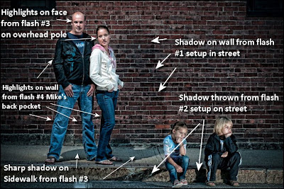
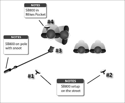
There were 4 flashes used, all set on manual, and all fired by Pocket Wizards.
#1 - This flash was setup at (about) the 8 o'clock position, was mounted on the table top stand that came with it so it sat directly on the street about 3-4 feet away, was "bare bulb" and was set at 1/32 power. It was tilted high to provided fill light on Mike & Julia's face. You can see the shadow on the wall behind them that was cast by this flash.
#2 - This flash was at (about) the 4 o'clock position, was hand held at about face level of the children was 2 feet away, was also "bare bulb" and set at 1/32 power. This flash was positioned to provide full head to toe light on the children. You can see their shadow on the curb is sharper than the one on the wall behind their parents because of the closeness of the flash.
#3 - This flash is on a paint pole using a Kacey Pole Adapter (you can get it @ Midwest Photo for $18.99), had a snoot on it (the only flash with a light modifier), set at 1/8 power, and was held about 2 feet overhead and slightly to the front of Mike. I wanted this flash to have an effect of looking like a street light. You can see the sharp shadow on the sidewalk under Mike and Julia that was cast by this light.
#4 - This flash was literally in Mike's back pocket pointing directly back at the wall and was set @ 1/64 power. I wanted this light to throw just a "whisper" of light on the wall that would "rim" Mike and Julia provided separation and depth.
There was no magic formula for the settings, I have been using my flashes in manual since watching the Strobist DVD's last December, after awhile you start getting a "feel" for what the power settings should be. Take a practice shot, then move (or adjust) the flash until you get the lighting effect you are looking for. That's why I have the shot of Mike alone, it was a shot to test the setup.
Regarding the Strobist DVD's, they are also available @ Midwest Photo for $139 and should be considered an educational must.
I marked up the images below to provide visual cues to go with the text above (click on either image to view larger and in a new windows).
All of the images were processed in Lightroom, with the exception of the one below, I used Topaz Adjust to give that gritty "Dave Hill" look.
Lastly, I want say "thanks" to Mike for letting me use his family portraits on the blog,


1 comment:
Totally love the photo of Mike's family. You did a fantastic job. Thanks for the details on the set up! I love projects like this!
Post a Comment