Just 36 hours left...

Before the end of the world... no wait, that's not it... photo contest, that's it, just 36 hours left before the end of our September contest.

The winner will be announced on Friday (10/1).

To enter all you need do is leave a comment on any post and upload an image to our Flickr group (contest details here and joining Flickr here).

Below are more images uploaded by our talented readers and fellow Flickr group members.

(clicking on any image below will open it larger and in a new window.)


Playing with content aware fill...

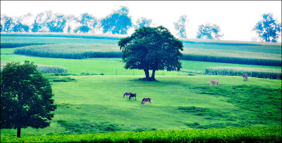
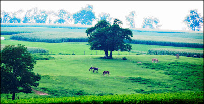
I was looking at an image shot with a point and shoot camera during our trip to Pennsylvania Dutch Country and thought "this would not suck as much of I cleaned it up a bit".

Again, it was taken with a point and shoot so there was a limited amount of pixels to play with so please be kind.

Below is the finished image, no fancy editing, for the things I wanted to remove I simply selected the item, hit the "Delete" key and then hit okay in the content aware dialog box. Only once did I "un-do" then "re-do" on one of the edits.


Here is the original image, see if you can find all of the things I removed. (kinda like a Where's Waldo hunt).


If you get tired of looking or just want to see the image with all of the items that have removed circled, follow this link.

(click on either image to open larger and in a new window)

A thank you note...

Many of you may remember a post I did just a couple weeks ago about Mary Lake, a Maine woman who makes (up to) a dress a day on a manual Singer sewing machine that she then gives to young girls in foster homes (you can read the post and see the video here).

After a long wedding yesterday I got home to find I had received a "thank you" card from Mary, as we had sent her a gift card (so she could pick out material and supplies she needed).

Here's a bit of it:

"I dropped off ten dresses last week and will drop off another 10 next week. Thank you for your kind and generous gift card, it will buy enough material to make (about) 30 dresses.

The small scraps of material left from making the dresses will be given to a woman how makes quilts for children in an orphanage and the large scraps will go to another woman who makes cloth dolls for little girls in Haiti.

So ALL the material will be used. Many thanks from us all."


Her words made me smile... so I read it again... and I thought of little girls dancing and spinning in their new pretty dresses.

Though I am not foolish enough to think I did anything of significance, it was Mary and her friends that took a (very) small act and turned it into something big and wonderful.


More contest images from our readers...

Below are a few more the outstanding images that have been submitted by our readers as part of the September contest.

For more information about the contest (prize - the David Honl 2 DVD set "Light") you can get contest details here. If you would like to add some of your own images to our Flickr group as part of the contest (or simply just to share) details for joining the group can be found here.

Well done everybody.

Clicking on any image below will open it larger and in a new window.


Bits & Pieces... Odds & Ends...

Today I am serving up some Bits & Pieces and one snippy comment, but I'll save that for last.


A friend of mine (hey Mike) does food photography and does it very well. One of his clients is "Once Upon a Chef".

I followed through one of his links to see more of the food photography and soon forgot why I was there and started collecting recipes fast and furiously.

Like the Homemade Caesar Salad Dressing, Late Summer Corn Soup, Crispy Tilapia Fingers, Chocolate Fudge Crinkles, Coconut Dream Tart.

So head over to Once Upon a Chef for some delicious recipes and wonderful photography.


The other day we did a review of MaxiVista, an iPad utility that will allow you to extend your desktop for a dual monitor setup.

Well, you will also want to check out (and bookmark) Terry Whites "Best App Site" for the "8 Must Have iPad Apps for Photographers".

Other to check out is the new release from Adobe "Photoshop Express" (free), the iPad photo editing app "PhotoPad" (free), and "Photo Wall for iPad" (yes, free) will help you make beautiful (and custom) photo collages that you can share by uploading or emailing (see their
YouTube video here).


Now... for snippy.

Only once in the 5 years and almost 700 posts have I said something less than complimentary (which can be found here), but this has my panties in such a bunch that I can't keep silent about it.

This tweet came across almost a week ago (I thought time would make it less annoying, but I was wrong): "Today's wedding: fabulous! Today's caterer: not so much. late, ran out of food; I had 3 rolls for dinner."

I find a few things upsetting about this kind of irresponsible "tweet", if you are going to publicly take someone to task (and perhaps cost them business) you need to have substance behind your statement, not just throw out an "Enquirer" headline.

Maybe there was a (legitimate and unavoidable) reason they were late, maybe they were given an incorrect head count and that's why they ran out of food, and maybe the caterer deserves criticism, but it should come from the person who hired them, NOT the photographer.

Impacting the livelihood of another should not be undertaken so flippantly.

In my eyes it reflects more poorly on the photographer than it does the caterer.

Playing in the shadows... another tutorial...

Here are some images that, though I liked the originals, wanted to change them just a bit.

The first set of images are from one of this years weddings.

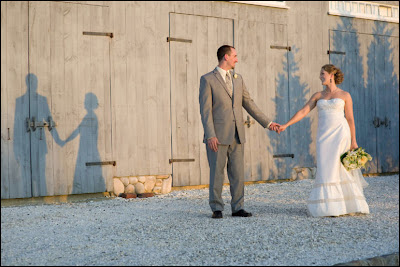
Here is the original image:

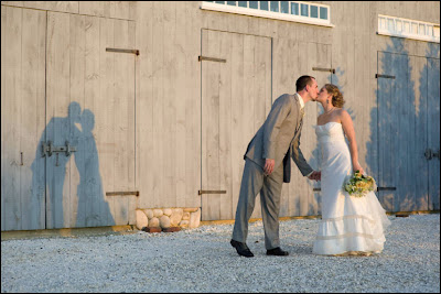
And I wanted the shadow that was cast in this image:

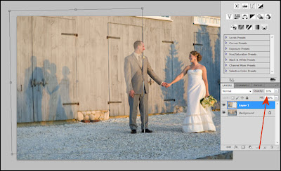
So I copied the the left half of the image of the shadow I wanted and brought it into image one. I dropped the opacity so I could see through it and then used free transform to get the boards on the side of the barn correctly aligned in both images.

I then created a layer mask for each of the two layers and using black hid the section of the barn that had the shadow of the bride and groom standing separately, then using white I painted over the "kissing shadow" to have it show through.

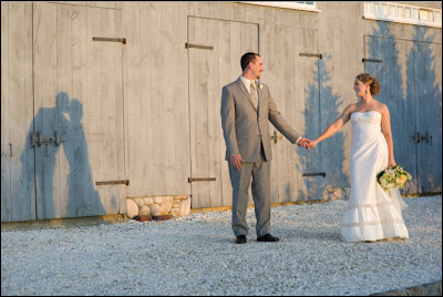
The final step was to burn the shadow slightly to make it a bit more prominent, and here is the final image:


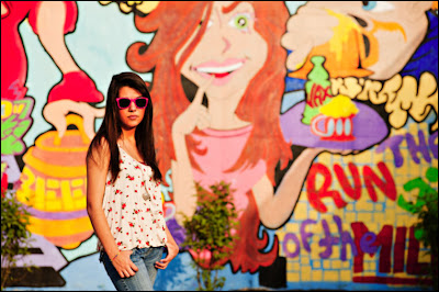
In this next set of images it's a bit different. Here is the original image:

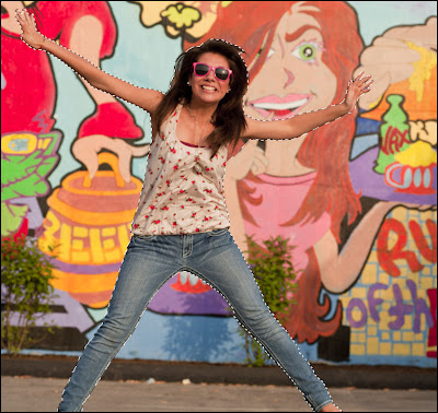
There was no shadow at all and the shot itself was a bit serious which does not reflect the fun personality of this young woman so I grabbed one of the "more fun" images and using the quick select tool grabbed just her from the shot. As I was going to use it as a shadow a precise cutout wasn't needed so I was happy with what quick select gave me.

I then brought the selection of her jumping into the original picture.

With the "jumping" layer selected I selected the "Lock Transparent Pixels" icon (visible right next to the paint brush above the layer). I then filled it with black (option+delete for MAC or Alt+Backspace for PC).

Next I applied the Gaussian Blur with the radius set to 20 pixels and then dropped the opacity to (around) 60%.

Because there was a bush in front of the wall where the shadow fell I used a layer mask to remove some of the shadow off the bush to make it look just a bit more natural in how the shadow fell over the leaves.

Here is the final shot:

Clicking on any of the images will open them larger and in a new window


Tutorial - Photographing people with glasses...

I ran this tutorial about 6 months ago, but as we have soooo many new readers and this is a very useful technique I am running it again.

People will often say to my wife "you must have beautiful pictures of your girls" (just because I own a camera or two) and her response is always the same "the cobbler's wife has no shoes", so I decided to surprise her by photographing my girls for a canvas pano that they would give her for Mothers Day.

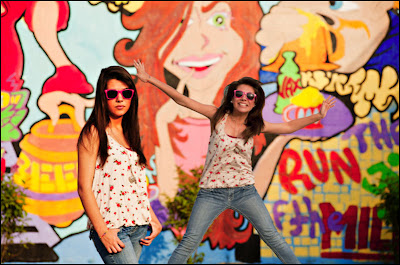
One of the problems I faced (other than the fact when I talk my girls hear "blah, blah, blah") is two of my three girls wear glasses. To make it even harder Emma (pictured above) has glasses with very wide sides (that work great at blocking light) AND she wears them further away from her eyes because she has incredibly long eye lashes.

So I took a few shots and was not at all liking the results at all so I decided to try something I had been shown by Jed Taufer, I instructed Emma to try to maintain her position as best she could while reaching up and removing her eye glasses and snapped a couple shots of her with her glasses off (this will work best if you shoot on a tripod).

I took all the images into Photoshop and using a lasso tool made a rough selection around her eyes (in the image without glasses).

I copied the selection and then pasted it into the image with the glasses. I lowered the opacity of the eyes I brought into the image and this helped me get them into the correct position. Make sure you increase it back to 100% before moving on. With the layer of the imported eyes selected I created a "hide all" (black) layer mask by holding down the "ALT" key and then clicking on the layer mask button.

Then using a white brush (with the primary/original layer selected) I carefully erased the lenses in her glasses revealing her eyes that I brought over and "hid" in the layer mask. If you make a mistake while erasing and remove part of the frames simply change the brush to black and paint over the area you meant to keep and it will "re-appear" (just remember the rule "white reveals and black conceals").

Here is her finished image.

And that was pretty much it.

The image below is the finished product, each of the girls were shot individually and them combined in Photoshop, using techniques similar to the "Twilight Poster" shoot.

By doing it this way all three girls were lit exactly the same, I didn't have to worry about who was casting a shadow on who, or listen to the inevitable bickering that comes when three teenage girls standing to close to each other.

;)

And so I would not have to worry about "perspective" when I combined all three girls my camera was on a tripod (and was not moved) and once I shot the first girl her position was marked and each girl that followed stood in exactly the same place.

Click on any of the images to view larger and in a new window.

If you have an iPad...


Of course that title would be even more interesting and fun if sung to the tune from the Fiddler on the Roof "If I were a rich man..." Ahhhh, the things that amuse me.

;)

This does more than amuse me. MaxiVista has created a great piece of software that allows you to use your iPad as a second monitor for either your laptop or desktop computer.

It was easy to install and worked perfectly the very first time I used it, 2 very important things (for me at least).

Even cooler, you can get it for less than $10!

This comes in handy especially when it comes to your laptop, it will give you maximum image viewing space.

I used it in a couple different ways, when using Photoshop I dumped all my tools into my iPad so that I had the entire laptop screen to view my images as large as possible.

Because my laptop screen is color corrected and my iPad is not, I actually put Lightroom (the program) on the iPad and had the image I was editing on my (color corrected) laptop screen.

MaxiVista is very inexpensive, works perfectly, and improves your workflow. Anything else I need to say?

Well, I could also tell you that if you don't have an iPad but have two computers (like a desktop and a laptop) they make a version of the software that allows you to share those screens too.

You can download a free trial here.

I know that someone out there is going to say "an iPad is a pretty expensive second monitor". Couple of things I want to say to that, if you add the cost of a second monitor AND a dual monitor card you are darn close to the price of an iPad. A dual monitor setup is just that, two monitors with a relatively limited role.

An iPad will allow you to do much more, not the least of which is to be one of your marketing tools by allowing presentation of your work ANYWHERE to potential clients and even allow that potential client to sign a contract (right on the iPad) making them your actual client.

Below is a short (1 minute) demo video showing MaxiVista at work, if it doesn't come through with your subscription you can head back to the blog or over to YouTube to watch it.

What's with the tomatoes?...


I have gotten more than a few emails asking me "what's up with tomato posts?".

Well, I'll tell you... anyone from the north (especially the northeast) knows that between the sub zero temps, the ice storms, and the snow, winter seems like the season that will never end.

The first sign that there's light at the end of the tunnel is when the seed catalogs start showing up in the mail. So the thing that keeps the cabin fever at bay is planning your garden, ordering seeds, and starting the seedlings.

Last year I decided to greatly expand my tomato garden, so I ordered my seeds in January, started them in February, and once they started popping through the soil would move them from one window to another following the sun throughout the day.

Come the end of March I would move them out to our three season sun porch in the morning and back inside late in the afternoon.

I would feed them every 10 days, move them into bigger pots as they grew, and basically spend some part of every day dedicated to my tomato plants until they were finally planted in the garden at the end of May.

Things went wonderfully, by the beginning of July we had hundreds of little green globes hanging all over my plants.

Then it hit, by the middle of July my garden was hit with early blight and by the time I realized what was going on it was too late. Within a week everything was dead.

So the success of this years garden (and harvest) has erased the last years bad memories.

I promise, after today won't bother you with any more pictures or posts about my tomatoes, except to say I just picked 60 more a couple days ago.

Contest images from our readers...

Below is just a fraction of the (almost) 600 the outstanding images that have been submitted by our readers as part of the September contest.

If you are interested in entering the contest (prize - the David Honl 2 DVD set "Light") you can get contest details here. If you would like to add some of your own images to our Flickr group as part of the contest (or simply just to share) details for joining the group can be found here.

Clicking on any image below will open it larger and in a new window.


30 free high res textures from V Gallery...

In an effort to raise awareness for an organization in Nepal called Hope's Promise V Gallery is giving away 30 free (high res) textures.

Hope's Promise
helps orphaned and vulnerable children in Nepal.

The textures are free (and actually shot in Nepal) and you can download them here.

I have these textures and suggest you get them too.

Pleasant surprises...

This week has held a couple of very pleasant (and unexpected) surprises.

First, PhotoComment is photography website and online magazine based in South Africa that's dedicated to sharing the passion of photography with their readers through reviews, tutorials, and photography contests.

Each Saturday they feature a website that has "held them captive"... well, guess who they named "Website of the Week" this past Saturday?

:)

Yup, it was Weekly Photo Tips, "a blog that comes highly recommended by some of the most prominent photographers like Scott Kelby".


Then while checking our stats the other day my jaw dropped to see the our subscribers has soared well past 2,000!

I share this with you not to brag, but to tell you how honored I am for the recognition and grateful that you spend some of your valuable time here with me at Weekly Photo Tips.

Thank you.


Free Adobe plugin - Pixel Bender...

Pixel Bender is a free plug-in for Photoshop CS5 that will give you a "painting" effect and a whole lot more.

Though it is from Adobe and free, it does not come as part if the Photoshop installation, you will need to head over to Adobe and download it here. You can check out (and download) Pixel Bender filters that have been designed by others at the Pixel Bender Exchange.

And if you're feeling real ambitious you can also download the Pixel Bender toolkit and develop some filters of your own.

In this episode of Photoshop User TV Dave Cross gives us a look at the capabilities of Pixel Bender.

My My friend Mike Palmer recently did a couple posts about Pixel Bender (here and here), below is one of the images he posted.

The details: "Shot using a D300 with a 24-120vr Nikkor... a 5 shot HDR merged and tonemapped in Photomatix Pro, to Lightroom 3 for small develop tweaks, then to CS5 to use Pixel Bender".

(click on image to view larger in a new window)

Football images with "Joel Grimes look"...

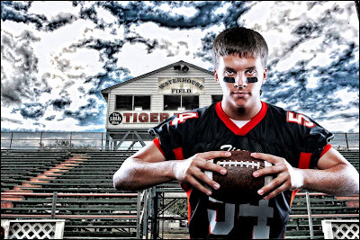
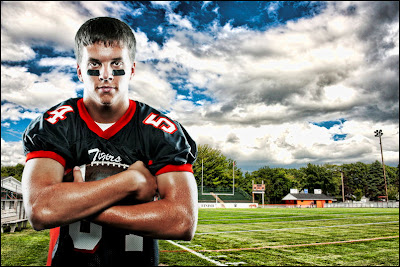
I have loved Joel Grimes work even prior to his doing a seminar here and I thought it would be cool to some high school sports stuff trying to "emulate" his look.

And to be honest, another motivator is that we think there is a market for this kind of work for high school athletes.

The first image has the more "dramatic" sky and folks that have already seen it either liked or disliked it because of the sky.

These are my very first attempts at this, so I have not perfected the technique, there are things I would like to to better.


Both images are composites. I shot Andy in the studio and then waited for a day that was sunny with big puffy clouds before I shot the football field.

There were two important tools that I used for these shots:

1. The background images are HDR and I used the "Joel Grimes" lighting and processing techniques for both the images (the subject and HDR background). If you have not had the pleasure of going to one of his seminars not to worry, the same information he teaches at the seminars is also available on DVD. I am lucky to have both (gone to the seminar and the DVD), for the reason I harp on every time I review a DVD, you get to watch it over and over again to refresh your memory and there are a lot of steps that go into these images and there is no way I could do it from my seminar notes. I will say that the DVD is not a Cecil B. DeMille production, but it wasn't meant to be, but that doesn't change the amount and value of the content one bit.

2. I use Photoshop CS5 and though it does a much better job at cutting out a subject from the background (with the new and improved selection tool/refine edge), it still didn't "cut it" for me (slight pun intended). Thank goodness I had ReMask from Topaz Labs. ReMask is a Photoshop plugin that's quick, easy, AND does an outstanding job. Bottom line, these images might not have been possible (for me) without ReMask. To see how well and easy this works you can check out the tutorials here and take it for a free test run here.

Helpful hint, when we shot the studio images of Andy they were done on a white background and I think life would have been made a lot easier had we used an 18% grey background.

So, let me here you thoughts, what you like and don't like about these images and what could be done to make them better.

Clicking on either image will open them in a new and larger window.

Making a dress a day...

There was a story on the local news that I just had to share.

It's about a woman named Mary Lake, a retired grandmother who makes (on average) a dress a day for little girls in foster care or living with people other than their parents.

As if that wasn't amazing enough, Mary sews those pretty little dresses on an antique manual Singer sewing machine (meaning no electricity, you operate it by a treadle using your feet).

Mary remembered how good she felt as a little girl when she got a new dress and wanted little girls who were having difficult times to know that same feeling.

I called Mary yesterday to ask if I could send her a check to help offset the cost of her project but she refused. She did (reluctantly) agree to let me send her a box of material, thread, and supplies.

If anyone out there is interested in doing the same you can contact me for her mailing address.

Enjoy the video below, it's a great example of how one person with a kind heart and a little effort can positively impact the lives of (so many) others.

Subscribers (and you know who you are) will need to return to the blog or follow this link to see the video as it isn't pushed through.

More on Joey L...

Just a few things I wanted to add to yesterdays post.

First, please go to his website and if you don't look at anything else check out the images from his homeless and Ethiopian projects. It's knock your socks off great stuff.

Speaking of Ethiopia, as part of the DVD we reviewed yesterday there is an 11 minute "behind the scenes" video that shows just some of the crazy stuff Joey went through to get the images.

Here's an example starting with the finished product:


And what he did to get that shot, balancing on the edge of an outcrop very, very high up.


He's either crazy or committed. Maybe a little of both.

Sessions with Joey L... Our review...

Let me ask a (silly rhetorical) question, if you could have Joey L come to your house and provide you with more than a half day of training, what would you say?

Is that a loud and resounding yes?

With "Sessions with Joey L" that's exactly what you'll get, over 4 hours of video tutorials that will walk you through setting up the lights, composing the shot, and processing the image and you can watch, pause, re-wind, and re-watch whenever you want.

Before I saw the first minute I noticed something I thought to be unusual, most training DVD's I have are pretty subject specific, but "Sessions with Joey L" covers it all, from soup to nuts as they say.

The five major topics are "Lighting Theory", "Photo Shoots", "Business", "Travel", and "Photoshop". With each of these having 3-6 sub-category videos.

"Lighting Theory" goes into how Joey sets ups his lights (and why) what equipment he uses (and why), and even provides you with DIY alternatives.

Sure he gets to use the best equipment now, but did you know for his first professional job he used a point and shoot camera, a couple of speedlights, and a softbox made from a torn bed sheet and a cardboard box. And if you think the images reflected that you'd be wrong, they are outstanding.

Throughout the entire DVD you'll see many of his images along with an explanation of the lighting setup and camera settings. Reverse engineering for photography (one of my favorite ways to learn).

Joey also goes in depth on the equipment he used on the Ethiopian shoot, the images were so stunning I had to watch this section twice. The subjects almost jump off the paper, they have a 3D quality, and he explains the lighting setup that gave it that look.

"Photo Shoots" takes us on 5 different location shoots where Joey shows us the setups, we see the difficulties of shooting on each location, and how those difficulties were overcome to "get the shot". This section has the best demonstration of "negative fill" I have seen.

In "Business" Joey talks how he conducts his business AND what he thinks to be important not so that you'll copy him, but so you can understand and draw wisdom from someone who has been successful in the photography business. He also shares ways that you can maximize your profit margin on commercial shoots (you'll have to buy the DVD to find out how).

He also covered a subject I have never seen talked about before, trust. The importance of gaining the trust of a client and what you can do to make it happen.

"Photoshop" demonstrates the processing and workflow that makes an image a "Joey L Image". There is a ton I could say about this section alone but will limit it to the following:

1. Joey shows us a technique for changing the skies (that is a mix of the original sky and a new one) that I have never seen before and is outstanding.

2. The black and white conversion he shows us is (I think) the closest thing to black and white film there is.


3. If you are going to shoot an image that will be removed from the background shoot it on an 18% grey background, not black, not white.

4. You will learn a great technique for fixing a blown highlight, which comforted me on two levels, it's nice to have a fix for that and it brings me comfort knowing that even Joey will occasionally blow a highlight.

;)

I have barly scratched the surface of the information covered in this DVD, but know that it is a treasure, really.

It is also $299, but before you balk at the price think about the value of knowledge, true knowledge. I promise you this DVD will do more for improving your photography, to help you capture a better image than a new lens will.

To me $299 is a lot of money (it's a half tank of heating oil) and I could never in good conscience recommend it to my readers if I did not think the value was there. It's there, it's a "pirates booty" for photographers.


I got my three people!...


The good folks at Stay Focused Press sent me three books for review, the Nikon D60, Nikon D3000, and the Canon XSi.

I have gone through the books but was looking for folks who shot with those specific cameras and now have them.

The books are going out to three of our blog readers to read and write a review, so look for it in a couple weeks.

Thank to everyone who took the time to respond and volunteer.